In a world that is saturated with information, capturing and retaining audience attention is a perpetual challenge. People have too many tabs open – both in their smartphones or laptops as well as in their minds.
During the 10 minute span of opening your phone, you consume at least 6 pieces of information across various platforms. Let’s say you open your phone to quickly check social media. You are sure to consume at least 5 ads and come across 7 or 8 brand or individual names within the first 5 minutes.
How do you make sure that one of those brands is yours? And more importantly, amidst all this noise, how do you ensure people remember you? This calls for a need to not only grab a person’s attention but also make them care about what you are trying to say. And to do this, your branding or message needs to be simple and concise while also being memorable and impactful.
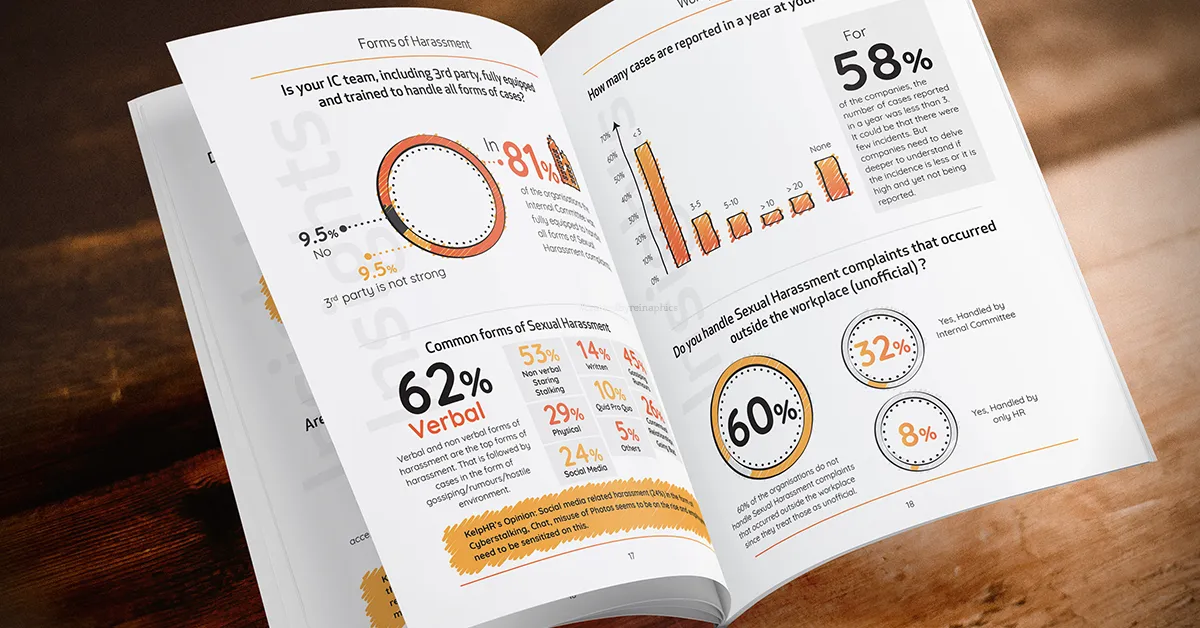
Data visualization emerges as a powerful solution, transforming complex information into digestible, visually appealing formats. Read on to explore the importance of data visualization, the struggles of holding attention, and the impact of infographics in our attention-deficit world.
What’s in this article?
Understanding the importance of data visualization
Data visualization is the art of representing data graphically, aiding comprehension and insight. In a digital world inundated with information, visualizing data becomes paramount to cut through the noise and deliver impactful messages.
As American author Edward Tufte aptly puts it, “Graphical excellence is that which gives to the viewer the greatest number of ideas in the shortest time with the least ink in the smallest space.”
And that sums up the crux of this entire blog! You need to consume less space and demand less brain power from your audience to process your message. The best way to make someone remember you is to give them something small and quick to grasp. They will process it quickly and hold on to it for much longer.
Challenges in capturing audience attention
The attention span of today’s audience is notably shorter. With a deluge of content vying for attention, traditional methods of conveying information often fall short.
The quote by statistician W. Edwards Deming holds true: “In God we trust; all others bring data.”
To make an impact, data needs to be presented in a visually engaging manner.
To illustrate the power of data visualization, consider a scenario where two individuals are presented with a complex dataset. But there’s a catch. While one person has just a big cluster of data and paragraphs of text to process, the other has a visual representation of the same.
Without a doubt, the person utilizing visualizations grasps the information effortlessly, while the other struggles. This is because the visual can be grasped in a single moment unlike a lack of it. You see an image of an upward graph and you automatically know that the data is positive.
On the other hand, you see a negative curve or visual cues like red color font and you know the news is negative. This dichotomy emphasizes the efficiency and accessibility that infographics provide.
Also read: How design influences customer’s buying decisions?
Benefits of infographics
Infographics emerge as a beacon in the sea of data we are presented with.
“The greatest value of a picture is when it forces us to notice what we never expected to see,” says American psychologist John W. Tukey.
Visualizing data through infographics can unveil insights that might be overlooked in raw numbers.
There are several advantages to this strategy:
Simplifying Complex Information: Infographics distill intricate data into comprehensible visuals, bridging the gap between complexity and clarity.
Enhancing Understanding and Retention: Visual elements aid memory retention. Infographics use images, charts, and icons to create a memorable narrative, making information easier to recall.
Increasing Engagement on Digital Platforms: In an age dominated by social media and online content consumption, visually appealing infographics stand out, attracting more views and interactions.
At the same time, balancing aesthetics with data accuracy is crucial. Infographics should be visually appealing without compromising the integrity of the data. Additionally, ensuring accessibility for diverse audiences, including those with disabilities, is imperative in today’s inclusive world.

Design principles and tools for effective infographics
Now that you know how infographics work, you need to also learn how to make them in the right ways. Crafting impactful infographics involves adhering to key guidelines and modern design principles:
- Clear Hierarchy and Organization: Information should be organized hierarchically, guiding the viewer through a logical flow of data.
- Use of Color, Typography, and Icons: Thoughtful use of color, font choices, and icons enhances visual appeal and aids in conveying information efficiently.
- Storytelling Through Data: An effective infographic tells a story. By weaving data points into a narrative, it captures attention and ensures information retention.
You can check online sites for the latest design principles. If you have access to Google or Apple’s latest design guidelines, you can also review those. These are the best ways you can stay updated about trends on what works and what people like to consume.
You can also use tools like Adobe Illustrator, Canva, and Piktochart. These graphic design tools that are mostly available for free offer robust design capabilities for creating custom infographics.
Platforms like Venngage and Easel.ly provide pre-designed templates, simplifying the infographic creation process. These platforms can also be substituted with AI advancements to create inspiration or complete designs in minutes.
Furthermore, tools like Tableau and libraries like D3.js empower users to create dynamic, interactive visualizations. This works as it offers people a more engaging experience that they will remember and engage with.
Also read: Design vs. art: A simple guide to decode the creative crossroads
Conclusion
In a world where information is abundant and attention spans are fleeting, infographics stand as a source to provide clarity. By using the principles of effective design, leveraging available tools, and continuously innovating, we can harness the power of infographics to communicate complex data in an attention-deficit world. The key takeaway from this discussion is clear: visualizing data is not just a trend. It’s progressively becoming a core necessity for effective communication.


