
In today’s fast-paced world, where people seamlessly switch between devices, the importance of a responsive website design cannot be overstated.
Imagine opening a website on your smartphone and having to zoom in and out to read content or struggling to navigate through a jumbled mess.
It’s not just frustrating; it’s a missed opportunity. And it makes no sense to lose your customers and potential audience due to such reasons.
Let’s delve into the transformative benefits and impact of responsive website design – a design philosophy that’s shaping the way we experience the internet.
What’s in this article?
What is responsive website design (RWD)?
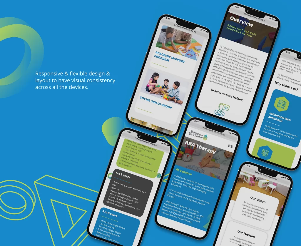
Responsive website design is the art of creating websites that adapt and respond to various screen sizes and devices. Whether you’re browsing on a desktop, a tablet, or a smartphone, a responsive website ensures that the layout and content look and function seamlessly.
This is achieved through CSS media queries and flexible layouts. These layouts are designed to automatically adjust elements like images, text, and navigation based on the user’s screen.
Also read: Our website design process explained: Phase I, Phase II & Phase III
Mobile-first approach
The smartphone revolution has turned the internet into a pocket-sized universe. As mobile browsing skyrockets, businesses can’t afford to ignore this trend. Enter the mobile-first design strategy.
Instead of starting with the desktop version and scaling down, designers now prioritize mobile layouts, ensuring that the user experience is optimized for smaller screens. This approach is exemplified by brands like Flipkart, Myntra, Amazon whose mobile app offers a shopping experience tailored for mobile users.
Better user experience
User experience is the heart of responsive design. Imagine visiting a restaurant’s website on your phone to find their menu – if the text is too small and the navigation is clunky, you’re likely to bounce off.
A responsive website design ensures a seamless and user-friendly experience, regardless of the device. This not only keeps visitors engaged but also provides a seamless browsing experience regardless of the device they use.
Related: How do you keep your website design’s branding consistent?
Search engine optimization (SEO) benefits
Speaking of rankings, Google has been advocating mobile-friendliness for years. In fact, they’ve moved to a mobile-first indexing approach, where they primarily use the mobile version of a site’s content for indexing and ranking.
Responsive design aligns perfectly with this approach, giving mobile-friendly websites a boost in SEO rankings. It also prevents the dreaded issue of duplicate content that can occur with separate mobile and desktop sites.
Cost and time efficiency
Once upon a time, developers had to create multiple versions of a website. This meant one for desktop, one for tablets, another for smartphones. This not only meant increased development effort but also added maintenance overhead.
Responsive design eliminates this complexity. With a single codebase, you’re covering all devices. This streamlined approach saves both time and money, making it a smart business choice.
Increased accessibility
The web should be accessible to everyone, regardless of disabilities. Responsive design plays an important role in achieving this and making your website more inclusive. By designing websites that adapt to different devices and screen readers, we create a more inclusive web environment.
This isn’t just about meeting legal requirements. It’s about embracing diversity and improving brand reputation as a socially responsible entity. When you consider your brand in today’s “woke” world, having a sensitized website is as important as having your brand logo.
Faster page load times
Speed matters. A lot. It is often the factor that makes or breaks your audience’s interest in your content. If a website takes too long to load, users won’t think twice before hitting the back button. They might not feel too eager to share the website with others as they themselves didn’t have a good experience. This means you lose both your customers and any referrals or recalls.
Responsive design contributes to faster page load times. When unnecessary elements are removed or adjusted for smaller screens, the website becomes leaner and quicker to load. This not only improves user satisfaction but also correlates with higher search engine rankings. It all comes back to user engagement and recall value – if you have a website that caters to their needs, the benefits will compound.
Cross-device and cross-browser compatibility
Remember the frustration of a website that works perfectly on Chrome but breaks on Safari? Responsive design tackles this challenge head-on. By ensuring consistent performance across devices, you can deliver a reliable experience to all users.
It also means having better performance on your app, browsers, and operating systems to have a streamlined and consistent approach. Your audience can’t say, “Oh, their website is better viewed through my desktop.”
And they can’t say, “Their website is better through the web; the app is too slow.” They also can’t say, “I like using the website through my Chrome browser. It is very unresponsive in Opera.”
Such comments are red flags that will break your business. And to be honest, no customer has the tolerance level to keep viewing your brand despite these flaws. It is either a yes or a no – never sometimes or maybe. Brands like MakeMyTrip exemplify this with websites that function flawlessly across various platforms.
Future trends in responsive design
As technology marches forward, responsive design evolves. The advent of 5G and foldable screens presents exciting possibilities. Websites will load faster, and layouts will adapt to new form factors.
Additionally, progressive web apps are gaining traction. These apps offer app-like experiences within browsers, seamlessly bridging the gap between websites and native applications.
Just as brands like Zomato navigated the shift from desktop to mobile with finesse, the next frontier is about seamlessly integrating with emerging technologies. At the same time, the winners will manage to maintain a user-centric design philosophy.
Conclusion
Responsive website design isn’t just a buzzword in today’s world. It’s a necessity to retain your audience’s attention and trust. It’s about creating an experience that respects the user’s preferences and works on various devices, offering a consistent and enjoyable journey.
Whether you’re browsing a lifestyle blog on your tablet or researching a product on your smartphone, responsive design ensures that every interaction is smooth. This is because every engagement counts and every visitor has to leave with a positive impression.
As we step into the future, responsive design will continue to shape the way we interact with the digital realm. It will ensure that the web remains an accessible and delightful space for all.
