In order to build a world-class website that achieves what it was intended to, the website design process should have three phases – Strategy, Design & Development.
In our earlier blog, which is here, we discussed the first phase which is the Strategy,
Now that we have your base laid out, let’s move to stage 2! It’s time to get designing.
In the design phase of the website, the below steps are essential to get a world-class design that is intuitive and user-friendly.
What’s in this article?
Choose the right design style and theme
The design style and theme of your website need to be established before getting started. This is because you will keep revisiting them while you plan the website’s visual identity and overall user experience.
It is important to select a design style that is consistent with your brand and resonates with your target audience. Consider your brand’s identity, industry trends, and the feelings you want your visitors to feel.
To conceptualize a suitable website theme or template, design a style tile that represents the overall look and feel of your website. Creating a style tile helps you to visualize the design direction of your new website.
Style tiles are a mood board-like, but for the website design, that includes font styling, colour selections, visual graphics style, and UI elements that express the visual essence of the brand. Style tiles offer a dynamic and interactive kicking off point for exploring and refining design without delving too far into the process.
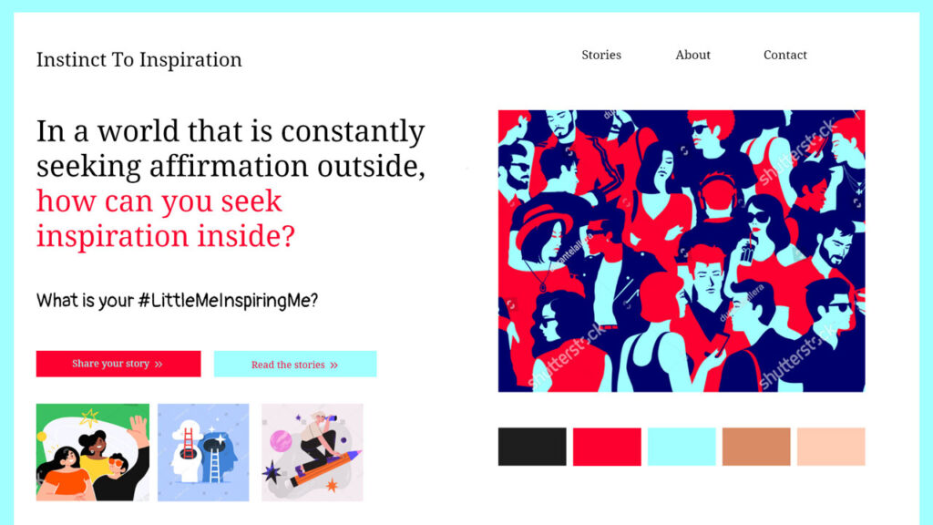
It serves as a visual reference that ensures consistency in design. This can be followed across different pages and sections of your website. You can also retain the same styles and colors across your packaging, social media, and other facets of branding.
Select and customize design elements
Once the style tile is finalized, it’s time to design elements such as icons, illustrations, and image embellishments that contributes to the visual appeal and brand identity of your website. When it comes to imagery, choose high-quality visuals that are relevant to your brand and resonate with your target audience.
Choose a color scheme that reflects your brand’s personality and creates a pleasant user experience. Consider the psychological effects of colors. Understand how they can evoke specific emotions or actions from your visitors. It also helps to base your logo on your brand’s style and what you stand for.
Related: What consequence does color can have on your brand?
Select fonts that are legible and align with your brand’s tone and voice. Use a typography hierarchy to guide users through the content and emphasize all the important information.
To maintain consistency with your brand standards, customize design elements to align with your established brand guidelines. This ensures that your website remains cohesive with other brand touchpoints. The ultimate goal is to ensure that all elements tie together to reinforce brand recognition.
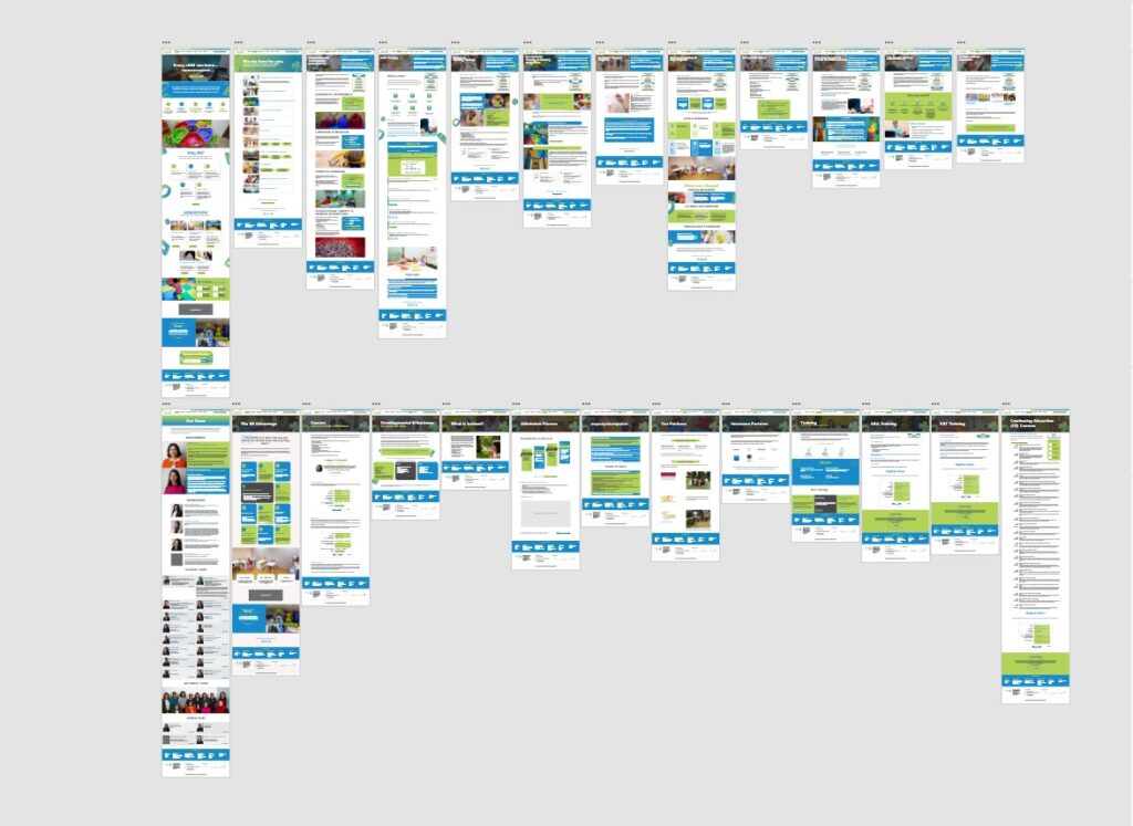
Wireframing and prototyping
Once you’ve determined your website’s goals and target audience, it’s time to bring your concepts to life using wireframing and prototyping. These are necessary if you want to establish some basic ideas and keep everyone on the same page.
Wireframing is generating a visual representation of the content and functionality by sketching out the layout and structure of each web page. Prototyping extends this concept by constructing interactive models that demonstrate user flow and functionality.
There are various wireframing and prototyping tools available that make the process easier and more efficient. Tools like Sketch, Adobe XD, or Figma offer intuitive interfaces.
They have a drag-and-drop functionality, enabling you to quickly create wireframes and interactive prototypes. These visual representations help you visualize the user experience and make informed design decisions.
Responsive web design and mobile optimization
In today’s mobile-driven world, having a responsive website is vital. Responsive web design ensures that your website adapts and displays optimally across different devices and screen sizes.
It provides a seamless user experience to help your audience remain invested in your brand. Furthermore, it eliminates the need for separate mobile versions of your site.
Optimizing your website for mobile devices involves designing and structuring content to fit smaller screens, optimizing image sizes for faster loading, and ensuring that touch-friendly elements are easily accessible.
You can appeal to the increasing number of internet users by focusing mobile optimisation. You must find out where your audience is and how they will find you. This is mostly done through their smartphones or tablets, so you should be there.

Incorporate intuitive user experience (UX)
Design User experience (UX) design focuses on developing a website that is easy to use and delightful to navigate. Consider the user journey and make sure your website’s navigation is clear, logical, and simple to use.
Use descriptive labels for menu items, incorporate intuitive icons, and provide breadcrumbs or site maps. This will help search engines and mainly users orient themselves within your site. There is a cohesive flow they can follow to stay on track.
Clear calls-to-action (CTAs) are essential for guiding visitors toward desired actions. Use visually prominent buttons or links, and ensure they are strategically placed throughout your website. Incorporate interactive elements such as sliders, carousels, or accordions to enhance engagement and make the browsing experience more dynamic.
It’s also important to follow UX design principles and best practices. Keep load times minimal, eliminate clutter, and provide ample white space for a clean and organized layout. Regularly test your website’s usability and make improvements based on user feedback and data analysis.
Test and iterate your design
The design process doesn’t end once your website is launched. It’s crucial to test and iterate your design continuously to enhance its effectiveness and user experience.
Conduct usability tests with real users to identify pain points, areas of confusion, or elements that need improvement. Gather feedback through surveys or user testing sessions to gain insights into how visitors interact with your website.
Based on the feedback and data collected, make necessary design adjustments to address any identified issues. It could involve refining the layout, improving navigation, or enhancing visual elements. The iterative design ensures that your website evolves and stays aligned with the ever-changing needs and expectations of your audience.
Conclusion
That was a lot but follow these steps to set the stage for a website that engages visitors. It will be the strong foundation that works for you from all angles and achieves your desired goals. We hope you enjoyed the second part of this website design guide as much as the first one.
In the final part of this series, we will explore the implementation phase, also called the web development of deployment stage. We will cover topics such as coding and development, content management systems, and search engine optimization. Stay tuned for more and to see the full picture of website creation!