Logo, brand voice, colors – these are three inseparable parts of your brand that define it and form a connection with your audience. Out of these three parts, a logo is more than a mere graphic that you add to your packaging, social media, website and marketing collaterals.
Logo design is the face of a brand and conveys everything about it. It plays a pivotal role in establishing and maintaining brand identity and recognition. Through clever design, logos can convey a brand’s values, philosophy, and personality.
The emotional resonance created by a memorable logo can forge a strong connection between the brand and its consumers. When people see a logo, they are familiar with, they experience feelings of loyalty and trust, ensuring constant brand recall.
In this article, you will read about
Retro-inspired logo redesigns
Over the past few years, there has been a noticeable shift in the world of logo design, with a significant number of brands opting for retro-inspired redesigns. The motivations behind this trend are diverse, ranging from a desire to tap into consumer nostalgia to reconnecting with a brand’s heritage. The resurgence of retro in logo redesigns reflects a longing for simpler times and a genuine appreciation for the aesthetics of the past.
Read on to learn more about how you can hop on this trend with your logo redesign.
Pizza Hut
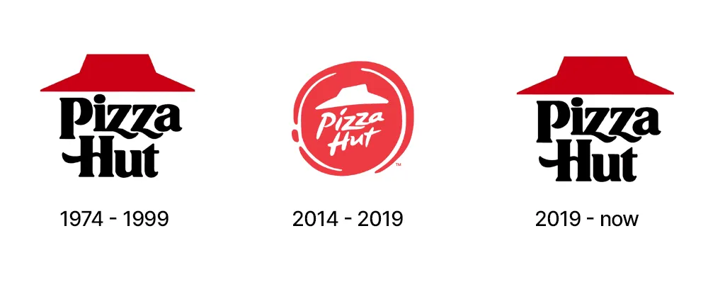
To better understand this concept, let’s explore a few examples, Pizza Hut stands out with its return to the classic logo. The move was met with positive attention as it demonstrated the timeless appeal of a well-designed emblem.
By revisiting its iconic logo, Pizza Hut tapped into the nostalgia associated with its earlier years. This evoked a sense of familiarity and warmth among customers of all age groups.
Kodak
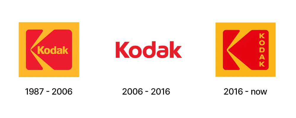
Similarly, Kodak is a brand that is deeply entrenched in photographic history. The modernized versions of its iconic logo blend elements from the past with a contemporary touch.
By drawing from the brand’s rich history, Kodak successfully bridged the gap between tradition and innovation. It ensured that the redesigned logo paid homage to its heritage while remaining relevant in the digital age.
Also read: 5 principles that make a logo design ‘Iconic’
Burger King
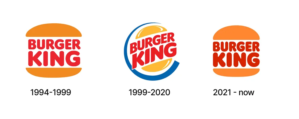
Burger King’s new logo draws inspiration from the brand’s iconic logos of the 70s and 80s, featuring a simplified and retro aesthetic. This move not only pays homage to Burger King’s rich history but also resonates with consumers who appreciate the nostalgia associated with the brand’s earlier visual identity.
MTV
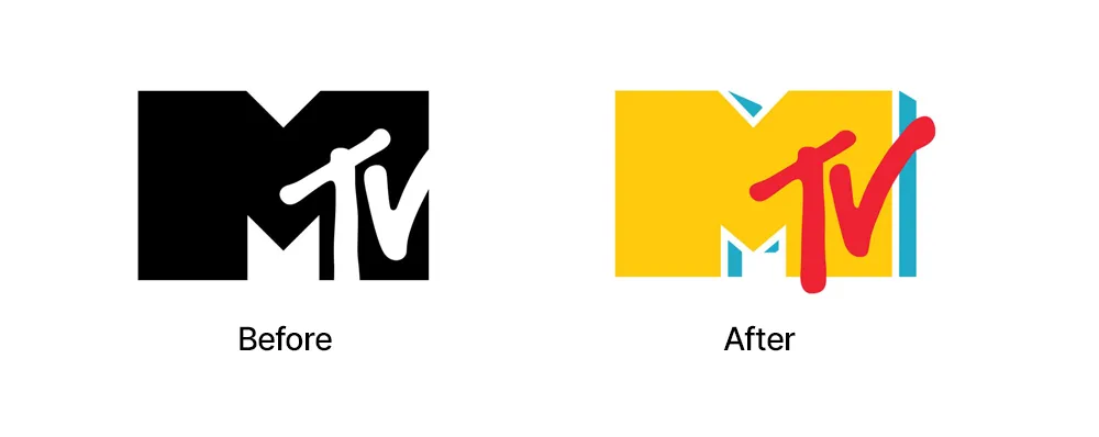
MTV’s new logo draws inspiration from its classic 80s aesthetic, featuring bold colors and a dynamic design. This approach not only resonates with viewers who grew up with the network but also introduces MTV‘s history to a new generation. This is a smart move as it creates a visual bridge between the past and the present.
Gap – Did it go wrong?
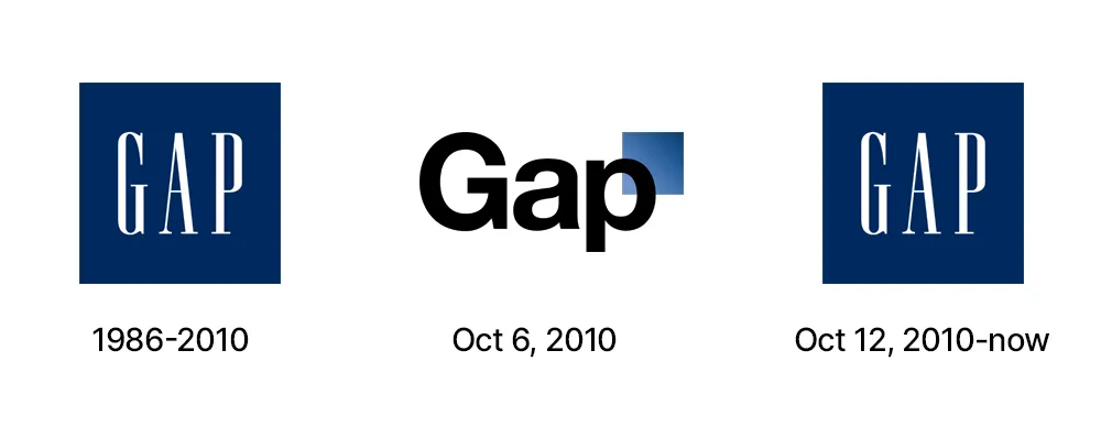
Gap, a well-known clothing retailer, experienced the highs and lows of logo redesign. The brand initially introduced a new logo that deviated from its iconic blue box design and serif font, leading to swift backlash from loyal customers.
However, this incident demonstrated the balance that brands must maintain when using modern or retro elements. The customer base Gap had maintained over the years lost their connection with the brand. Years of loyalty and trust were hurt when the personal connection with the brand got impacted. Gap eventually returned to the familiar blue box logo and serif font, acknowledging the power associated with its classic design.
Each of these brands showcases a unique approach to the retro movement in logo redesign, highlighting the diversity and creativity within this approach. These examples show us how brands leverage the power of nostalgia to create a strong and resonant visual identity.
Why the retro movement?
The surge in retro logo redesigns is not arbitrary or short-lived. It reflects a deeper understanding of consumer psychology and the power of nostalgia in branding. In an era marked by technological advancements and constant change, people often yearn for the familiar and comforting.
Retro logos offer a bridge between the past and the present, allowing brands to evoke a sense of nostalgia while maintaining relevance in the modern market.
Brands today aim to strike a balance between tradition and modernity. The retro movement allows them to tap into the emotional connections consumers have with the past while presenting a fresh and updated image. This approach not only resonates with existing customers but also attracts new ones who appreciate the authenticity and timelessness conveyed by retro-inspired designs.
Also read: 5 Timeless logo design concepts you should know
As consumers are bombarded with an increasing array of choices, brands need to stand out. The resurgence of retro logo redesigns provides a unique opportunity for brands to differentiate themselves in a crowded market. By revisiting classic designs or drawing inspiration from specific eras that appealed to their audiences, brands can create a distinctive visual identity that sets them apart.
Conclusion
The evolution of logos reflects not only design trends but also the inseparable bond between brands and consumers. The retro movement invites us to consider the appeal of the past in a world that seems fixated on the future. As we move forward, it will be interesting to see how brands create a balance between nostalgia and innovation, and how these redesigned logos continue to shape our perceptions and experiences.
