Shapes are used for visual communication in graphic design and brand identity. They can be used to convey emotions through colour, tone and size. Shapes can also be used as a tool to motivate action from the audience by creating a feeling of belonging or fitting in with the overall brand design.
In this article we will explore how different shapes evoke feelings and prompt actions; helping you create intuitive designs that inspire your audience to take further action.
Categories of shapes – Organic & Geometric
A shape is a drawing of an area or space within boundaries. Shapes can be two-dimensional, such as circles and squares, or three-dimensional, such as pyramids and cones. Other examples include letters from a font and the space around them on a page. The way that you use shapes in your designs can influence how people perceive them.
There are two broad categories of shapes: organic and geometric.
Organic shapes are more natural and human-like. They are imperfect and can make the design more natural and real, while geometric shapes are more rigid and mathematical and formed by definite lines, points, curves and boundaries.
Geometric shapes are common in logos, and though organic shapes are used in logos but they are more common in packaging or other design elements that need to be clearly understood at a glance.
Also read: Professional graphic designer advantage: Expertise & efficiency.
Organic Shapes
Comfort, interest, pleasure, nature, life, growth, love, calmness
Organic shapes are soft, curvy and more realistic. They remind us of nature, life, growth and love. When we see organic shapes we feel comfort and pleasure. Organic shapes also evoke feelings of calmness and peace.
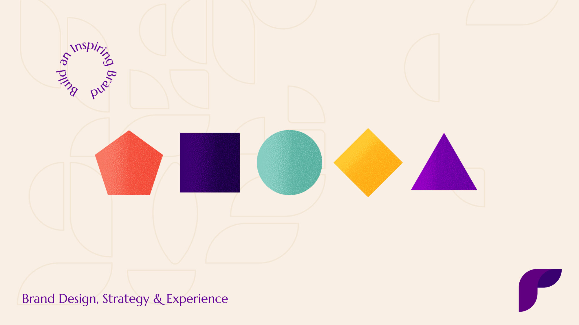
Circle
Inclusion, equality, wholeness, femininity, protection and completion.
The circle is a symbol of unity, wholeness and perfection. It’s also a symbol of equality because it has no beginning or end and therefore no hierarchy. The circle represents completeness, wholeness. The sun, moon and planets all look like circles from our perspective on Earth—a very small planet compared to those celestial bodies—which is why they’re associated with protection from harm or danger in many traditions around the world.
In design terms, the circle is often used to imply containment; The circle is frequently employed as a symbol for community, love, devotion, and unity in logos.
Since circles have no start or finish, they stand for life and the lifecycle.
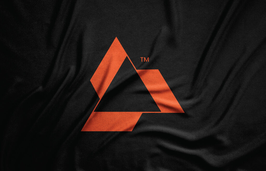
Triangle
Power, stability, energy, strength and aggression.
The shape of the triangle is a very strong symbol. A triangle is a sign of power and strength and energy and its dynamic nature is used to convey upward motion & direction.
They’re also used by companies as logos because they imply authority and strength from their shape alone! It is always best to use Triangles in upright position and not the other way around to avoid any negative connotations like decline, instability and downward motion.
Rectangle
Balance and order.
Rectangles are the most popular shape overall, and they’re used to create balance in design. Rectangles can also be used to create a sense of order and symmetry.
In fact, some psychologists believe that we tend to perceive objects that have a rectangular shape as being more stable than those with other shapes.
It is the most commonly used shape or form in logo design, website design, magazine, poster design and any branding & communication collaterals. This is the safest shape that can be used in branding design it cannot be interpreted in incorrect or negative meaning.
Rectangle logos work well when combined with other geometric shapes like circles or triangles because they provide balance between the two elements which gives them both equal weight at first glance when looking the design at any distance, far or near.
Also read: Brand packaging design psychology: Science that wins people’s hearts
Square
Stability, security and reliability.
The square is a shape that can be used to create a sense of order and structure. It is a stable shape that has meaning in many cultures.
The square is also associated with the sense of balance and harmony, which makes it an ideal shape for use in logo design because it gives off a feeling of calmness, peace and tranquility. In addition to its associations with stability, security and reliability, squares are also strong shapes that can be used to create a sense of strength and power when used on their own or as part of another logo design element such as an arrow or circle.
Diamond
Wealth and luxury.
Diamonds are the most expensive gemstone on Earth. They’re a symbol of wealth and luxury, and they’re associated with love and romance.
Because of these associations, diamonds are often used in jewelry branding to convey an image of romantic luxury. This is why many people associate the shape and color patterns of diamonds with certain colors or emotions—for example, pastel colors like pink and blue often come up in discussions about diamond engagement rings!
Oval or ellipse
Life, fertility, renewal and rebirth.
The oval shape is a very versatile, powerful shape that can represent almost anything. The oval is all about life, fertility, renewal and rebirth.
Pentagon (or five-pointed star)
Protection, balance, harmony and health.
The pentagon is a five-sided shape that represents protection, balance, harmony and health.
The pentagon is also an important shape in many religions as it represents the human body or soul. It is often used in different cultures to represent a god or goddess.
How can you use the psychology of shapes to improve your designs?
First, think about what shape would best represent your brand. Is it sharp and angular or round and soft? Would a triangle or circle be more effective for your design?
Next, consider how people will feel when they see that shape. What will they do as a result of seeing it. For instance, if someone sees an arrowhead-shaped logo they might feel motivated to click through to the next page; whereas if they saw a heart-shaped logo they may want to make a purchase right away!
Also read: What consequence does color can have on your brand?
Conclusion
Shapes are often used to convey meaning through their appearance alone: For example, rectangles are often used to communicate stability while triangles communicate sharpness and precision. Another use of shapes is to create visual hierarchy—to show which elements should be given more attention than others by placing them higher on the page or closer together than other elements in the composition (for example: creating an arrow for call-to-action buttons).
The psychology of shapes is an important part of graphic design. Using the right shape can help your audience understand the message you’re trying to convey. It can also create a more intuitive design that can improve user experience and increase conversion rates