Most designers face the exciting challenge of creating content for both print and digital platforms. While the fundamental principles of good brand design apply across all mediums, the specific considerations and techniques can vary significantly between print vs. digital formats.
Understanding these differences is crucial for designers to effectively communicate their message and engage their audience, regardless of the medium.
Let’s explore the key differences between print and digital design, providing insights into how designers can adapt their approach to create visuals for both traditional and modern platforms.
Inside this article,
Design fundamentals: Print vs. digital
One of the most fundamental differences between print and digital design lies in how images are rendered and displayed.
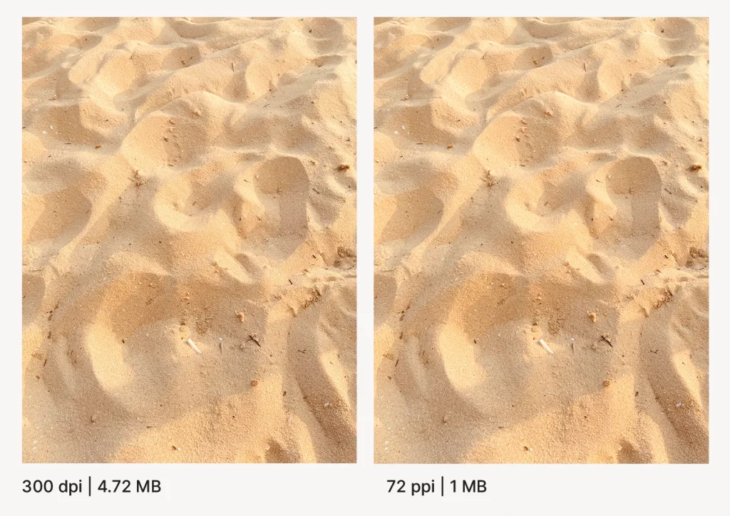
In print design, image quality is measured in DPI, which refers to the number of ink dots that can be placed within a one-inch line. Higher DPI means more detail and sharper images. For professional print work, a resolution of 300 DPI is typically the standard, ensuring crisp, high-quality images when viewed up close.
Digital designs are displayed on screens using pixels, and image quality is measured in PPI. The standard resolution for web images is 72 PPI, which provides a good balance between image quality and file size for quick loading times. However, with the advent of high-resolution displays, website designers now often work with higher PPI values to ensure images look sharp on all devices.
Why it matters
Understanding the difference between DPI and PPI is crucial because it affects how you prepare your designs.
A high-resolution image intended for print may appear unnecessarily large and slow to load when used in a digital format. Conversely, a low-resolution image designed for web use may appear pixelated or blurry when printed.
Color modes: CMYK vs. RGB
Another critical difference between print and digital design is the color mode used to create and display colors. CMYK (Cyan, Magenta, Yellow, Black) is the standard color mode for print design. This subtractive color model is based on how inks absorb and reflect light on physical surfaces. When designing for print, working in CMYK ensures that the colors you see on screen will more closely match the final printed product.
RGB (Red, Green, Blue) is the color mode used for digital designs. This additive color model is based on how light is emitted from screens. RGB offers a wider color gamut than CMYK, allowing for more vibrant and luminous colors that can’t be replicated in print.

Importance of color accuracy
Using the correct color mode is essential for ensuring color accuracy across different mediums. Colors that look vibrant on screen in RGB may appear dull or different when printed in CMYK. Conversely, designs created in CMYK may lose some of their intended color impact when viewed on digital screens.
Also read: What consequence does color have on your brand?
Typography considerations
Typography plays a crucial role in both print and digital design, but the considerations for each medium can differ significantly.
Fonts
In print, graphic designers have more freedom with font choices as they don’t need to worry about font availability on the user’s device. This allows for more creative and diverse typography. However, readability is still paramount, especially for body text in books, magazines, or brochures.
For digital designs, it’s important to consider web-safe fonts or to use font embedding techniques to ensure that the typography appears as intended across different devices and browsers. Sans-serif fonts are often preferred for body text on screens due to their improved readability at smaller sizes.
Legibility
Print designers must consider factors such as paper quality, printing method, and viewing distance when choosing fonts and determining font sizes. For example, a poster designed to be viewed from a distance will require larger, bolder typography compared to a book page.
In digital design, legibility concerns focus on how text renders on different screen sizes and resolutions. Designers must ensure that text is readable on both large desktop monitors and small mobile screens. This often involves using responsive design techniques to adjust font sizes and line heights based on the viewing device.
Also read: Website design dos and don’ts: The essential handbook
Layout and composition
Print design deals with fixed, static layouts that don’t change once printed. This requires careful planning and attention to detail.
- Margins and bleeds: Ensuring that design elements extend beyond the trim edge to avoid white edges after cutting.
- Safe zones: Keeping important content away from the edges to prevent it from being cut off.
- Spreads and folding: Designing with page turn and folds in mind for multi-page documents.
Digital design, on the other hand, must account for various screen sizes. It needs to be responsive to suit different orientations.
- Flexible grids: Using percentage-based layouts that can adapt to different screen sizes.
- Breakpoints: Defining points at which the layout changes to accommodate different devices.
- Scalable images: Ensuring that images resize appropriately without losing quality or impacting load times.
User interaction
Print design relies heavily on visual appeal and unique tactile experience to engage the audience. Choosing the right paper stock to complement the design and message. Using techniques like embossing, foil stamping, or varnishes to add texture and visual interest.
Digital design offers opportunities for user interaction, making the experience more dynamic and engaging. Allowing users to navigate and interact with the content using buttons and links is a great way to ensure this. You can use quirky animations and transitions to add visual interest and guide user attention. Furthermore, hover effects offer feedback and enhance the user experience.
Distribution and accessibility
Print materials have physical limitations when it comes to distribution. Considerations for print distribution include:
- Print runs: Determining the appropriate quantity to balance cost and demand.
- Shipping and handling: Factoring in the costs and logistics of physical distribution.
- Geographic limitations: Considering the challenges of reaching a wide audience with physical materials.
Digital design offers broader reach but comes with its own set of accessibility considerations:
- Screen reader compatibility: Ensuring that designs are accessible to users with visual impairments.
- Color contrast: Using sufficient contrast ratios to make text readable for all users.
- Global reach: Leveraging the internet to distribute content worldwide quickly and cost-effectively.
Cost and time considerations
Print design often involves higher upfront costs but can provide a premium feel. Paper quality, inks, and finishing techniques impact this cost. Also, printing processes like offset, digital, or specialty printing methods can play a role. The time and cost associated with creating and approving physical proofs is also a contributing factor.
Digital design has lower upfront costs but may require ongoing maintenance. There will be costs associated with design software and hosting platforms. Beyond this, you will notice ongoing costs for keeping digital content up-to-date and functioning properly.
Conclusion
Ultimately, the key to success lies in understanding the strengths of each medium and adapting your design approach accordingly. Whether you’re creating a glossy magazine spread or a responsive website, the fundamental principles of good design remain the same.