Just last week, we were browsing through some brand pages on Instagram. Although the brand name and services have been forgotten, we can never forget the timeless logo design they had incorporated. Why? Because the logo was minimal and used excellent typography to showcase its name.
The first two letters were YO and the brand works in healthcare. Very smartly, they had created a stethoscope using these two letters (Y being the earpiece and O being the heartbeat checker). This was an AHA! moment for us the moment we saw it and it has stood out even after all these days.
In the realm of branding, a logo holds significant importance as it serves as the visual representation of a brand’s identity. It acts as the face of the brand, creating a memorable impression on consumers and conveying the essence of the business. Sometimes, people may forget your brand’s name, but they will never forget your memorable logo and how smart it was!
To ensure that a logo stands the test of time, it’s essential to understand and incorporate timeless logo design concepts. Let’s explore 5 such logo trends that have lasted the test of time and continue to make their rounds. Let’s see how many of these you already knew and what other examples you can share for these logos.
What’s in this article?
Minimalism: Less is more
The first evergreen logo design trend we’ll explore is minimalism. In a world filled with visual clutter, simplicity holds immense power. Minimalist logos strip away unnecessary elements, focusing on clean lines, basic shapes, and precise typography to concisely communicate the brand’s core values.
One more subtle example could be Amazon. In case you are new to this, ever noticed the small arrow moving from A to Z? It shows that Amazon provides everything under the sun from A to Z for customers to buy!
Flipkart is a perfect example of a minimalist logo design. With its lowercase, slim font and yellow shopping bag, Flipkart effectively conveys its modern, streamlined approach to e-commerce. The lowercase f has been given a motion effect to convey speed along with a shopping bag.

Related: 5 principles that make a logo design ‘Iconic’
Typography: The power of fonts
Typography plays a significant role in logo design, allowing for creative expression and effective brand communication. The choice of font can convey a brand’s personality and evoke specific emotions.
You could consider Fabindia, the Indian clothing brand as an example. The Fabindia logo features a simple, lowercase wordmark in a casual and hand stroked font type. The letters are evenly spaced and perfectly aligned, creating a harmonious and balanced composition.
Fabindia communicates a sense of understated elegance and sophistication by opting for a typography-based logo. It is sustainable and gives off a timeless air – both resonating with the quality of products of the brand. The clean lines and uncluttered design convey the brand’s focus on quality and craftsmanship, while the simplicity of the logo allows it to be easily recognizable and memorable.
The typography used in the Ray-Ban logo is another distinctive example. It features text characterized by its simplicity and timeless appeal. The “Ray-Ban” text emphasizes the brand’s strong and confident image. The typography positions the company as an iconic eyewear brand, representing its commitment to quality, style, and enduring design.
Negative space: Creating visual depth
Negative space, the area around and between the main elements of a logo, provides a unique opportunity for creativity and storytelling. Clever utilization of negative space can create hidden meanings to intrigue your audience. It can also add depth to the design, making it visually captivating.
A notable example of this is the logo of FedEx. At first glance, it appears simple, but on closer inspection, an arrow between the letters ‘E’ and ‘x’ becomes apparent. This subtle use of negative space symbolizes speed, precision, and forward movement. This states FedEx’s core values and creates an engaging logo that sparks curiosity.
Another would be the NBC logo, commonly known as the “peacock logo.” It utilizes its negative space to create a distinctive outline of a peacock. By strategically utilizing negative space, the logo achieves a sense of balance and elegance while showcasing the peacock’s colorful plumage. It adds depth and dimension, enhancing its recognition and making it one of the most iconic logos in the broadcasting industry.
Dynamic and responsive: Adapting to different platforms
Scalability and readability are key considerations in logo design. Dynamic logos are designed to adapt and scale effectively across different platforms, screen sizes, and resolutions. Responsive logos ensure legibility and brand recognition by simplifying and optimizing key elements. Ola exemplifies scalability and versatility in its logo design.
With its simple, bold ‘Ola’ wordmark, the logo remains legible and impactful on different platforms. This holds whether it’s a small app icon or a large billboard. The adaptability of the logo ensures consistent brand recognition and maintains a strong visual presence across all touchpoints.
Walt Disney’s logo is another excellent example of a responsive and dynamic design. It features the word “Disney” written in a distinct, custom typeface. The letters are whimsical and have a slight curvature, conveying the brand’s playful and magical nature.
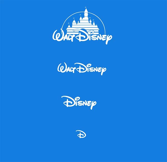
The logo can be easily scaled and adapted to different sizes and resolutions. The creators have ensured that the logo’s elements can be reduced or increased without losing its readability or iconic brand identity.
Color psychology: Evoking emotions
Colors profoundly impact human emotions and can evoke specific feelings and associations. Choosing the right colors for your logo can significantly influence how your brand is perceived.
Paytm, a leading digital payments and e-commerce platform in India, employs a vibrant shade of blue as the dominant color in its logo. Blue is often associated with trust, reliability, and security, making it an ideal choice for a brand operating in the financial technology sector.
The deep blue hue used in Paytm’s logo instills a sense of confidence and assurance, reinforcing the brand’s commitment to providing secure and trustworthy digital payment services.
Related: What consequence does color can have on your brand?
Another example would be the popular chocolate brand, Cadbury. The dominant color associated with Cadbury is purple, specifically a deep shade that has earned the name Cadbury Purple. This color choice has become synonymous with the brand and shapes consumer perception.
Purple is often associated with luxury, royalty, and sophistication. By incorporating this color into all aspects of its branding, Cadbury has created a sense of indulgence and premium quality. People use Cadbury Celebrations chocolates as gifts for special occasions and events – such is the positioning of the brand!
Conclusion
Timeless logo designs hold immense value in enhancing brand identity and creating a lasting impact on consumers. By using these ideas, brands can create logos that transcend fleeting trends and stand the test of time. You too can strengthen your brand identity and connect with your target audience.
Remember, a well-designed logo goes beyond aesthetics; it encapsulates the essence of a brand and communicates its values. Create a logo that not only captures attention but also represents your brand authentically. Invest time and effort in crafting a logo that resonates with your audience and aligns with your brand’s identity, and watch it become an enduring symbol of your success.
