While visuals such as color, imagery, and packaging materials play key roles in design, typography holds a unique position. It does the job of bridging aesthetics with communication in the final output.
The right font not only informs the consumer but also subtly conveys a brand’s personality, values, and message. Whether it’s the luxurious feel of a high-end product or the fun, approachable vibe of a children’s snack, typography has the power to evoke specific emotions and drive purchasing decisions.
Inside this article,
Typography in packaging design as a reflection of brand identity
Typography is more than just the letters and words used on a product package. It is a visual representation of the brand’s personality, essence, and values. A bold and modern sans-serif font might suggest innovation and sleekness, while a delicate serif font might evoke a sense of tradition and elegance.
The fonts used on a product’s packaging create an immediate, subconscious impression about the product inside. Choosing a typeface that aligns with the brand’s message helps differentiate it in a crowded marketplace.
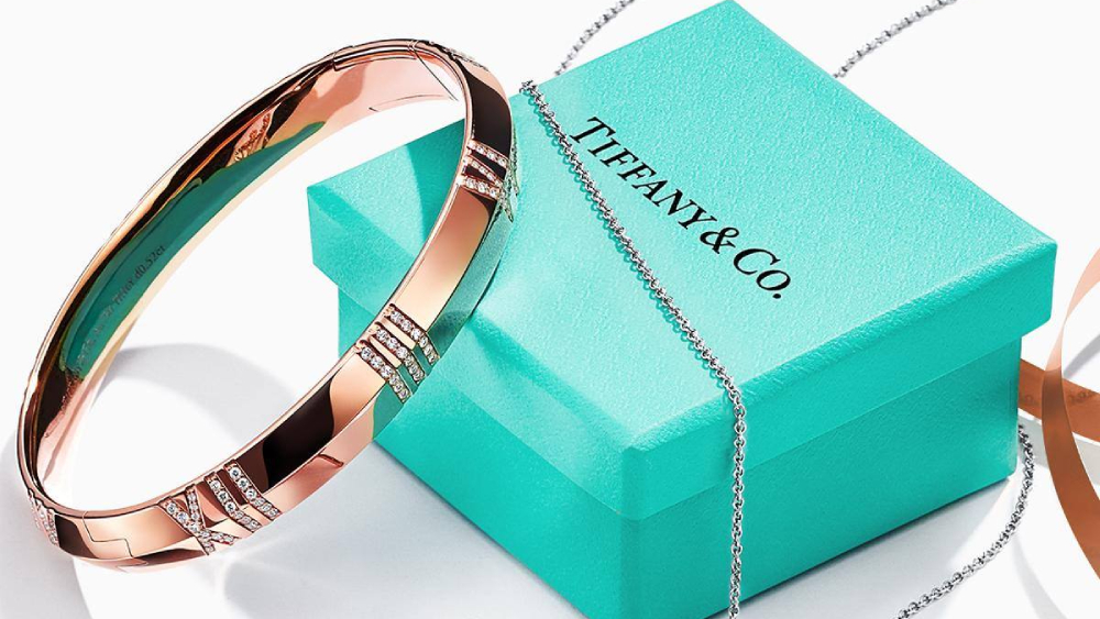
Think of Tiffany & Co.’s packaging: the elegant and restrained serif typeface, paired with its signature blue box, exudes luxury and sophistication.
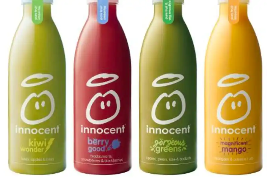
In contrast, brands like Innocent Drinks use playful, handwritten fonts to convey an informal, friendly tone, appealing to a health-conscious and environmentally aware audience.


Typography, when applied consistently across all packaging and marketing materials, strengthens brand recognition and builds a cohesive brand identity that resonates with consumers.
How typography shapes consumer perception
Fonts carry psychological weight.
Different font styles evoke distinct emotions and perceptions. Serif fonts, with their small lines at the ends of characters, are often associated with tradition, authority, and professionalism.
They are a common choice for products aiming to communicate heritage or trust, such as luxury goods or academic materials. Sans-serif fonts, characterized by clean lines and simplicity, are typically viewed as modern, approachable, and practical, making them ideal for products targeting younger, trend-savvy audiences.
For instance, luxury beauty brands like Estée Lauder and Dior often use serif fonts with high contrast, creating a feeling of exclusivity and refinement.
The choice of typography can also suggest the quality of the product. A carefully selected, well-designed font adds to the perception of a premium product, while a generic or poorly chosen typeface can detract from the brand’s credibility.
Also read: The power of packaging design: How it can shape your brand perception
Choosing the right font for packaging design
When selecting fonts for packaging, it is crucial to consider the target audience, the brand message, and the legibility of the text. Understanding the demographics and psychographics of the audience will guide font selection.
Brand message alignment is also key.
If your brand is all about tradition and heritage, a modern sans-serif font might not effectively communicate this. Conversely, if your brand is forward-thinking and progressive, a more contemporary typeface would be appropriate.
The fonts should also be legible across various sizes and at different viewing distances. Packaging is often viewed from afar on crowded shelves, so readability should never be compromised. Mixing fonts strategically can also enhance the design. For instance, using a bold typeface for the product name and a more understated font for additional information helps create a clear visual hierarchy that guides the consumer’s eye.
Typography’s role in packaging aesthetics
Typography is an integral part of packaging aesthetics, contributing to the overall look and feel of the product. The size and scale of the font can help draw attention to the most critical details, such as the product name, flavor, or key benefits.
For instance, large, bold typography can be used on the front of the package to highlight the product’s name, while smaller, more subtle fonts can be used for ingredients or instructions.
The placement of text on the packaging, along with line spacing and alignment, affects the balance and harmony of the design. Effective use of negative space can make the text stand out without overwhelming the visual elements.
A well-designed package balances text and imagery, ensuring that neither overshadows the other. Colors are also important – bold white type on a dark background, commonly used in minimalist packaging designs, ensures readability while maintaining a sleek aesthetic.
Typography and functionality
Beyond aesthetics, typography must serve a functional purpose in packaging. Consumers should be able to easily read the information under various conditions—whether viewing it in low light, from a distance, or even when the packaging material reflects light.
The font needs to perform well on the chosen packaging material, whether that be glass, plastic, cardboard, or metal. The design should account for any potential distortions caused by the curvature of bottles or cans, or the texture of a box.
Space management is another critical consideration in typography for packaging. Packaging often has limited space, especially on smaller products, and designers need to strike a balance between aesthetics and the delivery of essential information such as product benefits, ingredients, or instructions.
Avoiding Common Typography Pitfalls in Packaging Design
While typography can elevate a brand, poor font choices can have the opposite effect. Overly decorative fonts may look impressive in a design mock-up but can hinder readability, especially at smaller sizes or from a distance. A package filled with intricate, ornate lettering might confuse rather than attract potential customers.
Moreover, inconsistent font usage can dilute brand messaging and create a disjointed look. Brands should avoid mixing too many font styles or using trendy fonts that do not align with their core values or long-term vision. Consistency in typography, like all design elements, is crucial for building and maintaining brand recognition.
Emerging Typography Trends in Packaging Design
Typography in packaging design, like fashion, evolves with trends. Recently, handwritten fonts have surged in popularity, especially for organic, artisanal, or small-batch products. These fonts provide a personal, authentic feel, connecting the consumer to the brand’s story.
Retro-inspired fonts, with their nostalgic appeal, are making a comeback in packaging. They are used mainly for products that want to evoke a sense of the past, tapping into consumers’ love for all things vintage. On the opposite end of the spectrum, bold, maximalist typography is being used by brands that want to make a strong statement.
These oversized, attention-grabbing fonts are ideal for products that want to stand out on crowded shelves. Minimalist typography, characterized by clean, sans-serif fonts, continues to dominate modern, sleek packaging designs, particularly in tech and lifestyle products.
Also read: Psychology of shapes in graphic design and how to use them in branding
Conclusion
Typography plays an essential role in the success of packaging design, influencing both aesthetics and functionality. Careful consideration will ensure that the typography not only complements the design but also enhances the product’s appeal and readability.


