In the world of design, there’s a stark contrast between pro and amateurs. The gap isn’t just about years of experience but also a profound understanding of design principles, tools, and trends.
If you are someone who is looking for extraordinary designs, it’s time for a change. If you wish to change the tone or design language of your brand, read on to know why professional skills are ideal.
Let’s delve into the traits that set professional graphic designer apart and why their expertise is invaluable. We’ll also touch upon why opting for a branding design agency is often a smarter choice than attempting design work on your own.
What’s in this article?
1. Font mastery
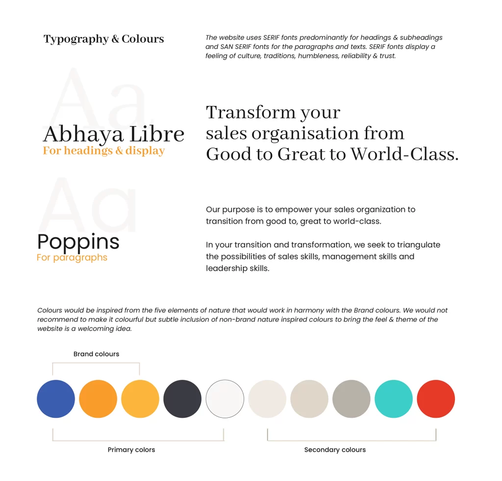
Pro graphic or brand designers don’t just pick fonts randomly. They understand the power of typography in conveying a message. Fonts like Poppins and Helvetica are their go-to choices for their professional and elegant appeal.
While amateurs may fumble through fonts, pros instinctively know which one suits the project, saving time and achieving a polished look. Pros have preset ideas and fonts for various purposes, allowing them to cut straight to the chase, ensuring a cohesive and visually appealing design.
“Choosing fonts has become second nature to me as I have been designing for 6 years now. I know which fonts to use for professional and elegant looks. I have a collection of fonts for printing and a set for quirky results. Based on what the client is expecting, I know exactly which fonts to use to set a mood for the brand,” said a senior graphic designer based in Chennai, India.

2. Shortcut savvy
Efficiency is the name of the game in the world of design. Pro graphic designers are masters of shortcuts, avoiding the tedious mouse clicks. Yes, something as simple as hitting a key on your keyboard instead of using your mouse will end up saving hours of work.
For instance, instead of painstakingly selecting each element with a mouse in Photoshop, they press a simple key like ‘W’. This is used to activate the selection tool and can save a designer close to two hours for a single static design. These shortcuts not only speed up the process but also reduce the chances of errors.
3. Shades of uniqueness
Pro graphic designers understand that design is not just about black and white; it’s about shades of gray and unique off-white hues. They avoid using pure white or black, opting for nuanced shades such as off-white, specific shades of black, or grayish tones. An amateur designer might use simple software to edit their images and won’t even have options to change their color gradients.
Using a combination of specific color shades will help infuse uniqueness and individuality into a brand. These subtle color choices make a brand stand out in a crowded market, as known by any professional designer.
4. Embracing white space
While amateurs often try to fill up white spaces, pros embrace it as a powerful design element. They understand that white space doesn’t equate to emptiness. Instead, they use it strategically to create a sense of balance and focus within their designs. White space is a canvas that pros expertly paint upon.
“Amateurs tend to shy away from white spaces, fearing emptiness. When I was new to the design industry, I used to add elements and watermarks in any gap I could find. It’s been four years and I have grown more comfortable with white spaces. I have even learned to use those spaces smartly to convey messages,” said a graphic designer from a reputed agency in India.

5. Trendsetters, not followers
Pro brand designers are trendsetters, not trend followers. They possess a keen eye for spotting emerging design trends and seamlessly integrating them into a brand’s identity. It’s about connecting themes and trends with the core essence of a brand, not blind imitation.
Unlike amateurs who might blindly hop on design trends, pros analyze if a trend is relevant. Furthermore, they know where to find the right trends and collaborate with other designers. For example, they use Behance and Dribble to hunt for modern ideas and concepts that can inspire them.
“When I see a trend, I don’t immediately look for ways to use it. I analyze it and wonder how to incorporate it organically. For example, just because the world is embracing minimalism, doesn’t mean I will also use it just to stay competitive. I will check if it resonates with my brand values and client requirements,” said a senior graphic visualizer based in India.
6. Skillful adaptation to new software
Professional designers don’t shy away from new software. While Photoshop may suffice for a single image output, they embrace tools like Cinema 4D, 3D design, and AI to stay ahead of the curve. Continuous learning and upskilling are their mantras.
They know that AI and modern tools are not here to replace them. They are here to help and hone their skills.
7. The power of AI
Amateurs often view AI as a threat, either trying to use it as a shortcut or fearing that it will replace them. In contrast, pro designers understand how to leverage AI to enhance their work.
They use AI tools as assistants, adding their unique manual touches to achieve even better outputs. For them, AI is a tool, not a replacement.
Summing up
In conclusion, the distinction between a professional graphic or brand designer and an amateur is evident in their font choices, efficiency, creativity, and adaptability. It is best to opt for these innate talents that are honed by continuous experience and learning. It can save you time and provide better results than trying to get the work done yourself.
Know that it isn’t just about skill. It’s about mindset, experience, and a deep understanding of design principles. When considering design work, it’s often wiser to opt for a branding design agency with a team of seasoned professionals rather than attempting it yourself.
Their expertise and creativity can elevate your brand to new heights. It will ensure that your design stands out in a competitive landscape.


