You can’t deny that logos stand as the most recognizable and impactful element of a brand’s identity. They serve as the visual representation of a brand’s values, ethos, and promise. While the design landscape is constantly evolving, a critical debate often emerges: Should a logo align with current design trends, or should it leverage timelessness?
In this article, you will read about,
Understanding logo design trends
Logo design trends are shaped by contemporary aesthetics, technological advancements, and shifting consumer preferences. These trends can bring a fresh, modern appeal to a brand, making it relevant and engaging. However, the risk lies in their transient nature; what is trendy today may become outdated tomorrow. Let’s explore some prevalent logo design trends and evaluate their effectiveness through the lens of an Indian brand example.
Also read: Embracing the nostalgic wave by retro-inspired logo redesigns
1. Minimalism
Minimalism in logo design is characterized by simplicity, clean lines, and a stripped-down aesthetic. It aims to convey a brand message in the most straightforward manner, often using monochromatic schemes and basic shapes.
For example, Zomato, a food delivery and restaurant discovery platform, revamped its logo in 2018 to a more minimalistic design. This current logo features a simple, lowercase typography with a bold red color, representing energy and appetite. Minimalism can be highly effective in creating a versatile and easily recognizable logo.
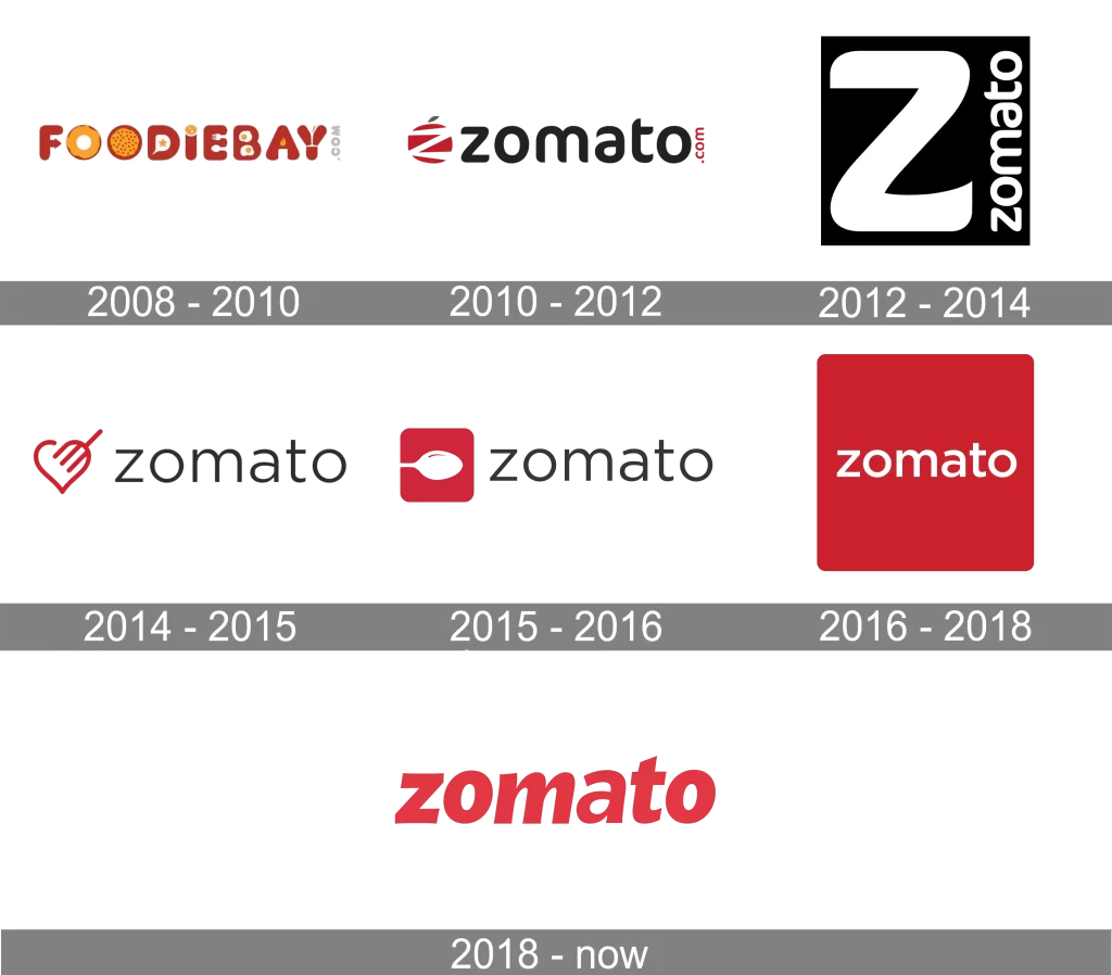
For Zomato, the minimalist design works well across various platforms and scales seamlessly from app icons to billboards. However, while minimalistic logos are trendy and adaptable, they can sometimes lack the distinctiveness needed for long-term brand recall. Apple, on the other hand, illustrates how minimalistic logo can be both trendy and timeless.
2. Responsive logos
Responsive logos are adaptable designs that change in size, complexity, or color depending on where they are used. This trend caters to the diverse range of digital devices and screen sizes.
Responsive logos are highly practical in today’s multi-device environment. They ensure consistent branding across different mediums and improve user experience. However, frequent changes in logo design can potentially dilute brand identity if not managed carefully.
Kodak is a fine example that employed a responsive logo to adjust its design elements based on the application. The iconic “K” symbol and the wordmark ‘Kodak’ can be simplified as the screen sizes reduce, where it is practically impossible to use the full logo in a small device like an Apple Watch.
3. Hand-drawn and custom typography
Hand-drawn logos and custom typography styles inject a personal, unique touch into a brand’s identity. This trend is often used to convey authenticity, creativity, and individuality.
For example, Paper Boat, a brand known for its traditional beverages, uses a hand-drawn logo with a playful and nostalgic feel. The quirky typography and illustrative elements reflect the brand’s emphasis on storytelling and cultural heritage.
These hand-drawn logos resonate well with consumers seeking authenticity and a personal connection with brands. For Paper Boat, the custom typography aligns perfectly with its brand narrative. However, this trend might not suit every industry, particularly those requiring a more professional or corporate image.
Using timelessness in logo design
Timeless logos transcend fleeting trends and remain relevant over decades. They are often characterized by simplicity, versatility, and a clear representation of the brand’s core values. Tata Group, a global conglomerate with a diverse range of businesses, has a logo that epitomizes timelessness.
The Tata logo, introduced in 1988, features a stylized “T” within an oval, symbolizing trust, reliability, and innovation. The logo has remained largely unchanged for over two decades, reinforcing the brand’s enduring values. The Tata logo exemplifies the power of a timeless design.

Its simplicity ensures easy recognition, while its symbolism communicates the brand’s heritage and vision. A timeless logo can build lasting brand equity, fostering strong emotional connections with consumers. However, the challenge lies in creating a design that remains relevant and engaging amidst evolving market dynamics.
Also read: 5 Timeless logo design concepts you should know
Trends vs. Timelessness: A comparative analysis
The debate between adopting trendy versus timeless logos hinges on various factors, including brand identity, industry, target audience, and marketing strategy. Let’s compare the advantages and drawbacks of each approach.
| Advantages of trendy logos | Drawbacks of trendy logos |
|---|---|
| Relevance: Trendy logos can make a brand appear modern and in tune with current consumer preferences, potentially attracting a younger audience. Engagement: Contemporary designs often incorporate elements that resonate with current cultural or technological trends, enhancing engagement. Flexibility: Trendy logos can be more adaptable, allowing brands to experiment with different styles and formats. | Short Lifespan: Trends are inherently ephemeral. A logo designed around a specific trend may quickly become outdated, necessitating frequent redesigns. Brand Dilution: Constantly changing logos can confuse consumers and dilute brand identity, undermining long-term recognition and loyalty. Inconsistent Messaging: Trend-driven designs might prioritize aesthetics over conveying a consistent brand message. |
| Advantages of timeless logos | Drawbacks of timeless logos |
|---|---|
| Longevity: Timeless logos remain relevant over long periods, reducing the need for frequent redesigns and associated costs. Brand Equity: Consistent use of a timeless logo can strengthen brand identity and equity, fostering deep consumer trust and loyalty. Versatility: Timeless designs are often simple and versatile, ensuring effective application across various mediums and contexts. | Perceived Staleness: A timeless logo might be perceived as outdated or noninnovative, particularly in fast-paced industries where innovation is key. Limited Flexibility: Timeless logos may lack the flexibility to adapt to new trends or technologies, potentially hindering their appeal to younger demographics. Initial Design Challenge: Creating a truly timeless logo requires a deep understanding of the brand’s core values and future vision, making the initial design process more complex. |
Strategic considerations for logo design
Deciding between a trendy and a timeless logo design involves careful strategic consideration. Here are some key factors to weigh:
- Brand Identity and Values: A logo should reflect the core identity and values of the brand. For brands rooted in tradition and heritage, a timeless design might be more appropriate. Conversely, brands focused on innovation and youthfulness may benefit from a trendy approach.
- Industry Dynamics: The nature of the industry plays a crucial role. Fast-evolving industries like technology and fashion might necessitate more frequent updates to stay relevant. In contrast, sectors like finance and education might prioritize stability and trustworthiness, favoring timeless designs.
- Target Audience: Understanding the preferences and expectations of the target audience is essential. Younger audiences might be more receptive to trendy, dynamic logos, while older demographics might prefer the familiarity of a timeless design.
- Long-term Vision: A logo should align with the brand’s long-term vision and strategic goals. It’s important to consider how the logo will evolve with the brand and whether it will continue to resonate with consumers in the future.
Conclusion
Ultimately, the key to effective logo design lies in a deep understanding of the brand’s essence and a clear vision for its future. A well-designed logo can become a powerful symbol of a brand’s identity, values, and aspirations, forging lasting connections with consumers across generations.
