Today, capturing your audience’s attention is both more challenging and more critical than ever. Whether you’re crafting content for social media, designing eye-catching YouTube thumbnails, or creating compelling marketing materials, understanding how to tailor your visuals to your specific target market and design for different audiences can make all the difference.
What works for enthusiastic kids who wish to learn will not work for busy employees and homemakers. At the same time, the same content needs to be tailored for multiple members of your target group. Let’s say you have a video on online education for part-timers. If you want an eager student to click on your YouTube video, you need to use a different language as compared to that of a businessman who is trying to balance his work and studies.
With that being said, let’s dive into the world of platform-specific design strategies that will help your content stand out and convert.
Inside this article,
Social media: Designing for the scroll
Social media platforms are the modern-day coliseums of content, where brands battle for attention in the endless scroll. Each platform has its unique flavor, and savvy marketers know how to spice up their visuals accordingly.
Facebook’s diverse user base demands a versatile approach to visual content. The key here is to create scroll-stopping images that work in both square (1:1) and landscape (16:9) formats. Vibrant colors and faces tend to perform well, with posts featuring faces receiving a whopping 38% more engagement.
But don’t just stick to still images – Facebook users love video content, which gets 59% more engagement than other post types. Think about creating short, attention-grabbing videos with captions, as 85% of Facebook videos are watched without sound.
Instagram is where visual content truly shines. High-quality, aesthetically pleasing images are the order of the day here. But don’t just focus on your feed – Instagram Stories and Reels are where the real engagement happens.
These features allow you to capture attention with motion graphics and behind – the – scenes content that feels more authentic and immediate. Carousel posts are another secret weapon, with a 1.4x higher reach than single-image posts. Use them to tell a story or showcase multiple products in a single swipe.
LinkedIn may be all business, but that doesn’t mean your visuals should be boring. Clean, professional graphics are a must, but don’t be afraid to incorporate data visualizations and infographics – they’re particularly effective on this platform.
In fact, LinkedIn posts with images receive 2x more engagement than text-only posts. Stick to a portrait format for optimal visibility in the feed, as most social media platforms are accessed via mobile phones. It is a good idea to use a color palette that conveys your brand colors.
Twitter (aka X)
On Twitter (now called X), your visuals need to pack a punch quickly. Eye-catching images are crucial to stand out in fast-moving feeds. Infographics are particularly powerful here, being 3x more likely to be retweeted than other image types.
Keep text on images minimal – Twitter users are scanning, not studying. And remember, Twitter moves fast, so don’t be afraid to post multiple visuals a day to increase your chances of being seen.
YouTube
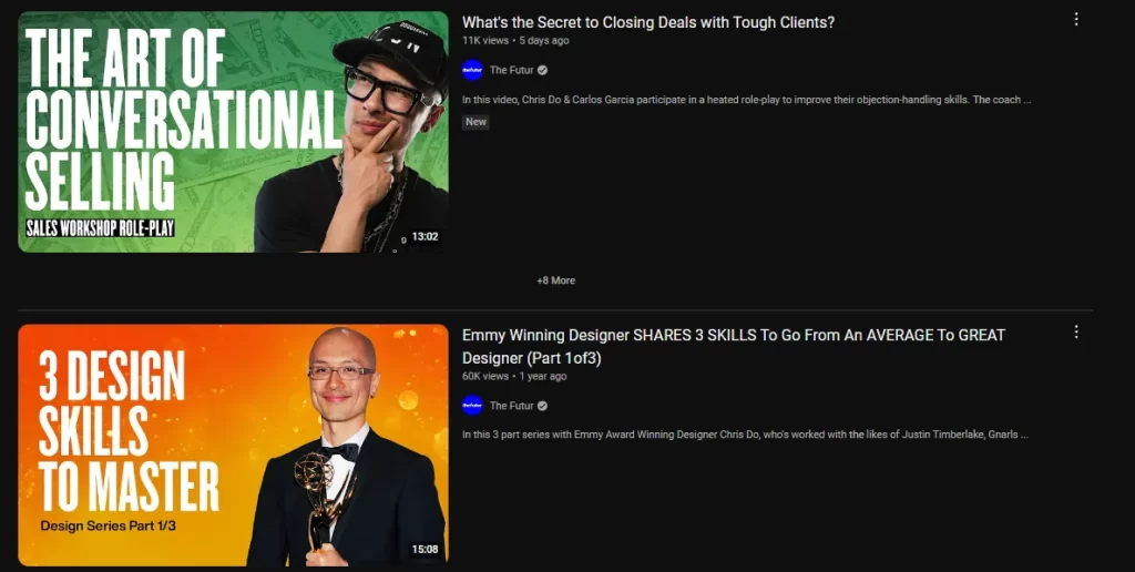
YouTube is the second-largest search engine in the world, and your thumbnail is your first impression. A staggering 90% of the best-performing YouTube videos have custom thumbnails. So how do you create thumbnails that convert? Start with high-contrast colors to stand out in the sea of suggested videos.
Include close-up faces showing emotion – this can increase your click-through rate by up to 30%. Use large, easy-to-read text overlays to communicate your video’s value proposition at a glance. And remember, consistency is key. Create a recognizable style for your thumbnails to build brand recognition across your channel.

Video content: Moving pictures, moving audiences
Video is no longer the future – it’s the now.
By 2022, online videos are predicted to make up more than 82% of all consumer internet traffic. But creating compelling video content isn’t just about what you say – it’s about how you present it visually. Your first three seconds are crucial. That’s all the time you have to grab your viewer’s attention before they scroll past.
Use consistent branding elements like colors, fonts, and logos to build recognition. Always include captions – not only does this make your content accessible, but it also caters to the 69% of people who watch videos with the sound off on mobile. And speaking of mobile, optimize your videos for on-the-go viewing with vertical or square formats.
Also read: Creating a brand style guide: Ensuring consistent visual communication
Infographics: Data, visualized
In a world drowning in information, infographics are a life raft for your audience. These visual representations of data and information are liked and shared on social media 3x more than any other type of content. The secret to a compelling infographic? Start with a clear hierarchy of information.
Choose a color scheme that matches your brand and resonates with your target audience. Use icons and illustrations to break up text and make complex information more digestible. And above all, keep it simple – your audience should be able to understand the key points at a glance.
The A/B testing advantage
Think you know what your audience wants? Think again. A/B testing is the secret weapon of successful marketers, with companies that use it seeing conversion rates increase by up to 49%. Test different elements of your visual designs
- Color schemes
- Image styles
- Layout and composition
- Placement and design of your call-to-action buttons
Conclusion: A visual for every platform
Mastering the art of platform-specific visual design is about creating connections that drive engagement and conversions. By understanding the visual language of each platform and the preferences of its users, you can create content that communicates your message effectively.


