A brand style guide is more than just a set of rules. It’s a strategic tool that helps maintain a cohesive brand image, fostering recognition and trust among your audience.
Whether you’re a startup crafting your first brand identity or an established company looking to refine your visual communication, a well-crafted style guide is indispensable for success in today’s competitive market.
Inside this article,
Why a brand style guide is essential
The importance of a brand style guide cannot be overstated, yet many companies overlook this critical asset or fail to utilize it effectively in their branding efforts. Here’s why every brand should prioritize creating and implementing a comprehensive style guide:
Consistency is key
In a world where consumers are bombarded with countless messages daily, consistency in brand presentation is crucial for standing out.
A style guide ensures that every touchpoint, from your website to your business cards, presents a unified image of your brand. This consistency builds familiarity and trust with your audience over time.
Alignment across teams
Modern businesses often have multiple teams working on various aspects of brand communication. Designers, marketers, content creators, and even external agencies all need to be on the same page.
A style guide serves as a common reference point, ensuring that everyone understands and adheres to the brand’s visual identity, regardless of their role or location.
Efficiency and cost-effectiveness
By providing clear guidelines, a style guide streamlines the creative process. It reduces the time spent on decision-making about visual elements and minimizes the need for revisions due to inconsistencies. This efficiency can lead to significant cost savings in the long run.
Brand recognition
Consistent use of visual elements like logos, colors, and typography helps in building strong brand recognition. When consumers can easily identify your brand across different platforms, it strengthens your market presence and can lead to increased customer loyalty.
Professionalism and credibility
A cohesive brand image conveys professionalism and attention to detail. It shows that your company values quality and consistency, which can enhance your credibility in the eyes of customers, partners, and investors.
Adaptability in a multi-channel world
With the proliferation of digital platforms, brands need to maintain their identity across a wide range of media. A comprehensive style guide provides the flexibility to adapt your brand elements for various channels while maintaining a consistent core identity.
Onboarding and training
For new employees or external collaborators, a style guide serves as an invaluable onboarding tool. It quickly brings them up to speed on how to represent the brand visually, ensuring that even newcomers can contribute to maintaining brand consistency.
Legal protection
By clearly defining how your brand elements should be used, a style guide can help protect your brand from misuse or misrepresentation, which is particularly important for trademark protection.
Also read: Comprehensive branding checklist for small businesses – strategy + design
Key elements of a brand style guide
Some important must-haves in your style guide include:
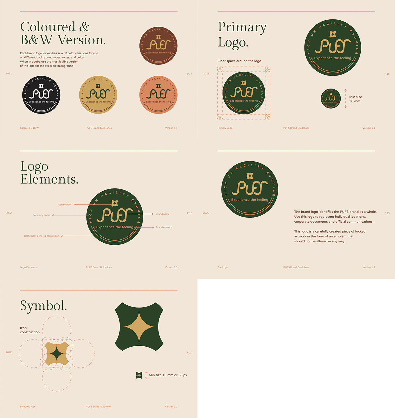
1. Logo usage
Your logo is the cornerstone of your visual identity. The style guide should cover:
- Primary and secondary logos: Showcase your main logo and any variations (e.g., horizontal, vertical, icon-only versions).
- Dealer’s logo: If applicable, provide guidelines for how authorized dealers or partners can use your logo.
- Minimum size: Specify the smallest size at which your logo can be reproduced while remaining legible.
- Clear space: Define the area around the logo that should remain free of other elements.
- Do’s and don’ts: Illustrate correct and incorrect uses of the logo, including placement, color variations, and modifications.

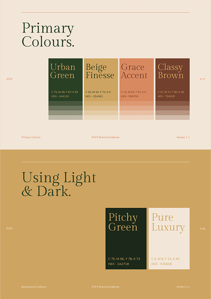
2. Color palette
Colors evoke emotions and play a crucial role in brand recognition. Include:
- Primary and secondary colors: Define your main brand colors and supporting palette.
- Color codes: Provide Hex codes for digital use, RGB values for screen display, and CMYK values for print materials.
- Color usage guidelines: Explain how and when to use each color in your palette.

3. Typography
Consistent use of fonts reinforces your brand identity. Specify:
- Brand fonts: List primary and secondary typefaces.
- Font hierarchy: Outline font sizes and weights for headlines, subheadings, body text, and captions.
- Usage guidelines: Provide rules for font pairing, alignment, and spacing.
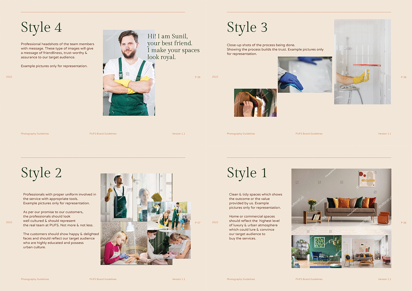
4. Imagery and photography
Visual content should align with your brand’s aesthetic. Include:
- Style guidelines: Describe the overall look and feel of images (e.g., bright and cheerful, muted and professional).
- Subject matter: Specify types of imagery that align with your brand values.
- Editing style: Provide guidelines for filters, color grading, or other editing techniques.
- Examples: Show approved images and those that don’t meet brand standards.

5. Iconography
If your brand uses custom icons, provide:
- Icon style: Describe the design style (e.g., flat, outlined, filled).
- Usage guidelines: Explain where and how icons should be used.
- Icon library: Include a set of approved icons or guidelines for creating new ones.
6. Brand graphical elements
Showcase any recurring design elements unique to your brand. If applicable, provide:
- Brand specific patterns: Explain how the pattern was derived, scale, proposition and color specifications.
- Brand specific textures: If applicable, provide the brand specific textures to be used across all the visual applications.
- Graphical elements: Include any applicable graphics that has been designed specifically for the brand and explain its usage and application.

7. Brand Voice
The tone of your brand’s communication conveys its personality and builds relationships with your audience. Whether playful, formal, authoritative, or approachable, the tone needs to reflect the core values of your brand.
Voice Examples
- Website: Friendly, professional, and informative. E.g., “Welcome to [Brand Name], where innovation meets simplicity. Whether you’re here to explore our latest offerings or get inspired, we guide you every step of the way.”
- Social media: Casual and engaging. E.g., “Ready to take on the day? We’ve got what you need. Check out our new arrivals and let us know your favorite!”
- Emails: Personalized but formal. E.g., “Hi [Customer Name], we hope you’re enjoying your [Product]. Here’s a little something to help you get even more out of it.”
The tone might vary a bit depending on the platform—formal on websites or newsletters, but more relaxed and conversational on social media. However, it should always reflect the brand’s core identity, ensuring consistency across channels.
8. Corporate identity guidelines
This section covers how your brand appears in corporate settings:
- Business cards: Design and layout specifications.
- Letterheads and envelopes: Templates and usage guidelines.
- Email signatures: Standardized format for all employees.
9. Signages
For physical locations or events:
- Exterior signage: Guidelines for storefront or building signage.
- Interior signage: Rules for in-store or office displays.
- Event materials: Specifications for banners, posters, and other event-related signage.
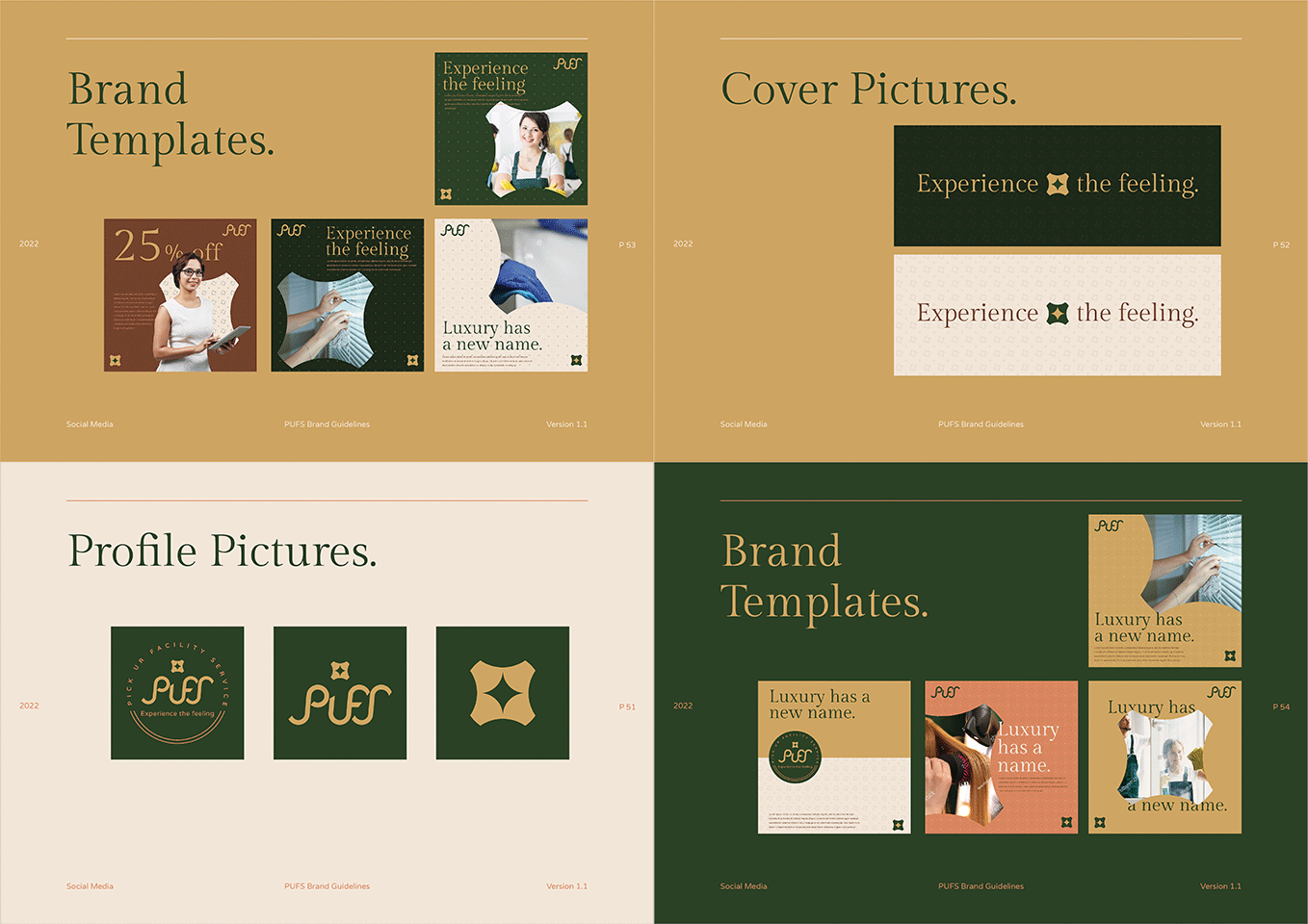
10. Social media templates
Ensure consistency across digital platforms:
- Profile pictures and cover images: Specifications for different social media platforms.
- Post templates: Guidelines for creating on-brand social media content.
- Hashtag usage: List of brand hashtags and rules for creating new ones.

[Bonus tip] Web design elements
For your digital & web presence, specify the design and hover states for different types of buttons, specific UI elements, color usage etc.
You can also specify the form elements with styling for input fields, checkboxes, and dropdown menus. In terms of navigation menus, provide guidance on design and interaction guidelines for website menus.
Also read: Startup branding: Essential steps to create a strong brand identity
Tips for maintaining consistency
Encourage all team members to refer to the style guide regularly. Make it easily accessible, perhaps as a digital document that can be quickly searched. It is always a good idea to schedule regular reviews of the style guide to ensure it remains up-to-date with your brand’s evolution.
Create a system for team members to suggest updates or ask questions about the style guide. This will ensure that everyone is on the same page and even new employees know what to keep in mind. Keep track of changes to the style guide and ensure all team members are using the most current version.
Conclusion
By investing time and resources into creating and maintaining a comprehensive style guide, you’re not just defining how your brand looks. You’re shaping how it’s perceived in the marketplace. Remember, consistency breeds familiarity, and familiarity breeds trust. That trust can be the differentiator that sets your brand apart.
Reach out to our team to design the brand style guide for your brand so that it is future-ready.


