In the world of design, principles serve as the fundamental guidelines that shape our creative process. Whether you’re a seasoned professional or just starting your journey in design, understanding and applying these graphic design principles is crucial for creating effective, aesthetically pleasing, and impactful designs.
This blog will explore 10 essential design principles that every graphic designer should know and incorporate into their work.
Inside this article,
Must-know graphic design principles
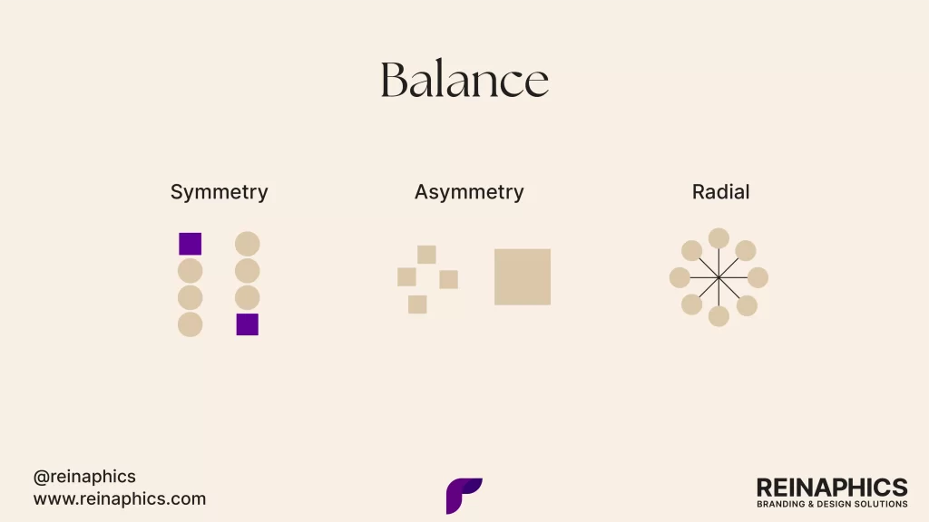
1. Balance
Balance is the distribution of visual weight within a composition. It’s about creating harmony and stability in your design, ensuring that no single element overpowers the others unless intentionally done for emphasis.
There are two main types of balance:
- Symmetrical balance: This is when elements are evenly distributed on both sides of a central axis. It creates a sense of formality and stability.
- Asymmetrical balance: This involves balancing unequal elements through careful placement. It can create more dynamic and interesting compositions.
Achieving proper balance is crucial because it provides a sense of order and helps guide the viewer’s eye through the design. A well-balanced design feels comfortable to look at and can effectively communicate your message without visual distractions.
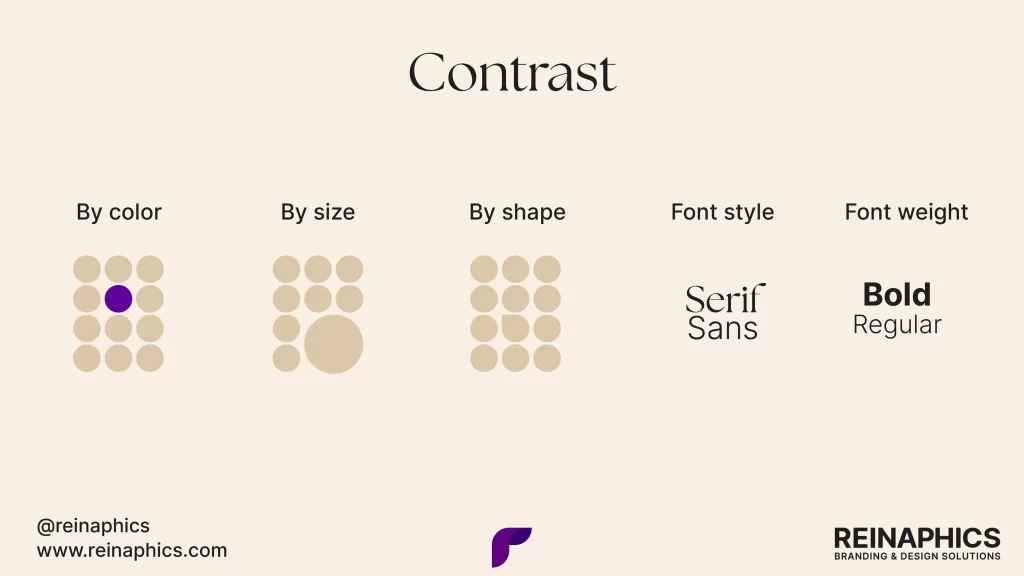
2. Contrast
Contrast is the juxtaposition of opposing elements to create visual interest and emphasis. It can be achieved through differences in color, size, shape, or texture.
Contrast is essential for several reasons:
- It helps guide the viewer’s attention to important elements.
- It improves readability and legibility, especially in typography.
- It creates visual hierarchy and helps organize information.
For example, using a light-colored text on a dark background creates strong contrast, making the text stand out and easier to read. Similarly, pairing a large headline with smaller body text creates contrast in size, helping to establish hierarchy.
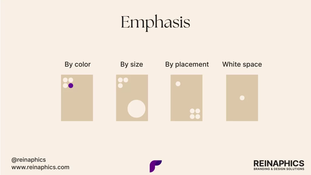
3. Emphasis
Emphasis, also known as focal point, is the creation of a dominant element in your design that draws the viewer’s attention. It’s about making certain elements stand out from the rest.
Emphasis can be achieved through:
- Size: Making an element larger than others.
- Color: Using a contrasting or bold color.
- Placement: Positioning an element in a prominent location.
- White space: Surrounding an element with empty space.
The principle of emphasis is crucial because it helps prioritize information and guide the viewer’s eye to the most important aspects of your design. Without a clear focal point, a design can feel cluttered and confusing.
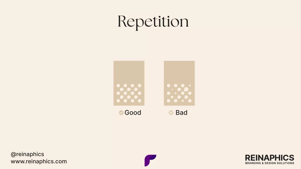
4. Repetition
Repetition involves reusing certain design elements throughout your composition. This could be a particular color, shape, texture, or any other visual element.
The benefits of repetition include:
- Creating consistency and unity in your design.
- Reinforcing and strengthening the overall look and feel.
- Tying different parts of a design together.
- Establishing a rhythm that makes the design more engaging and memorable.
For instance, using the same color palette across different pages of a website creates a cohesive look. Similarly, repeating a particular shape or icon throughout a brochure can tie different sections together visually.
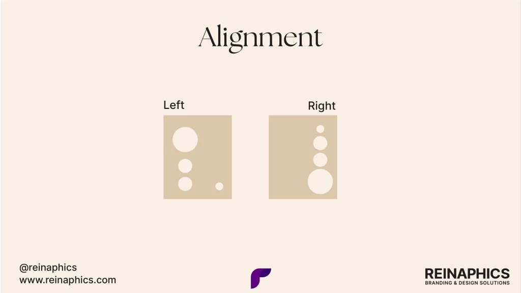
5. Alignment
Alignment refers to the placement of elements in a design so that their edges line up along common rows or columns. It’s about creating order and organization in your layout.
Good alignment:
- Creates a clean, sophisticated look.
- Makes the design easier to scan and read.
- Establishes a visual connection between elements.
There are four main types of alignment: left, right, center, and justified. The choice of alignment can significantly impact the overall feel of your design.
For example, left-aligned text is often easier to read in long paragraphs, while center alignment can create a more formal, symmetrical look.
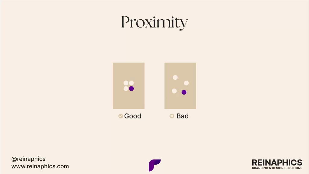
6. Proximity
Proximity is the principle of grouping related elements together. It suggests that elements that are close to each other are perceived as being related, while elements that are farther apart are perceived as being less related.
Effective use of proximity:
- Helps organize information.
- Reduces clutter in your design.
- Improves the understanding of information.
- Creates a clear structure in your layout.
For example, in a business card design, you might group the name, title, and contact information together, separated from the company logo, to create clear distinctions between different types of information.
7. Hierarchy
Visual hierarchy is the arrangement of elements in a way that implies importance. It guides the viewer’s eye to the most important elements first, then to the least important. Hierarchy can be established through larger elements that are perceived as more important.
It can also be brought about using bolder or contrasting colors that stand out more. It is worth keeping in mind that elements at the top or center are often seen first. More space around an element draws attention to it. These are a few things you can remember.
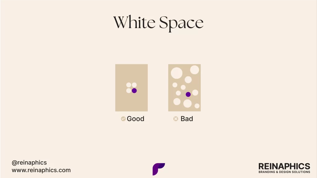
8. White space
White space, also known as negative space, refers to the empty areas in a design. Despite its name, it doesn’t necessarily have to be white.
Many designers make the mistake of trying to fill every inch of space, but embracing white space can often lead to more effective designs. For example, luxury brands often use ample white space to create a sense of elegance and simplicity.
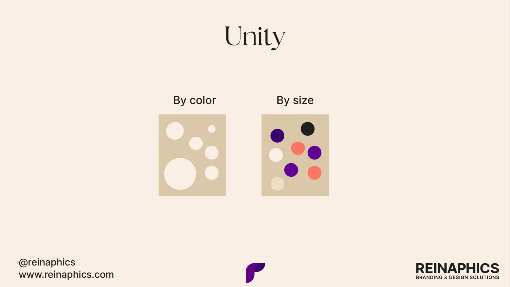
9. Unity
Unity is the principle that all elements in a design should work together to form a cohesive whole. It’s about creating a sense that all parts of the design belong together. A unified design feels complete and harmonious.
Without unity, a design can feel disjointed and confusing. For instance, using a consistent color scheme and typography across all pages of a website helps create a unified user experience.
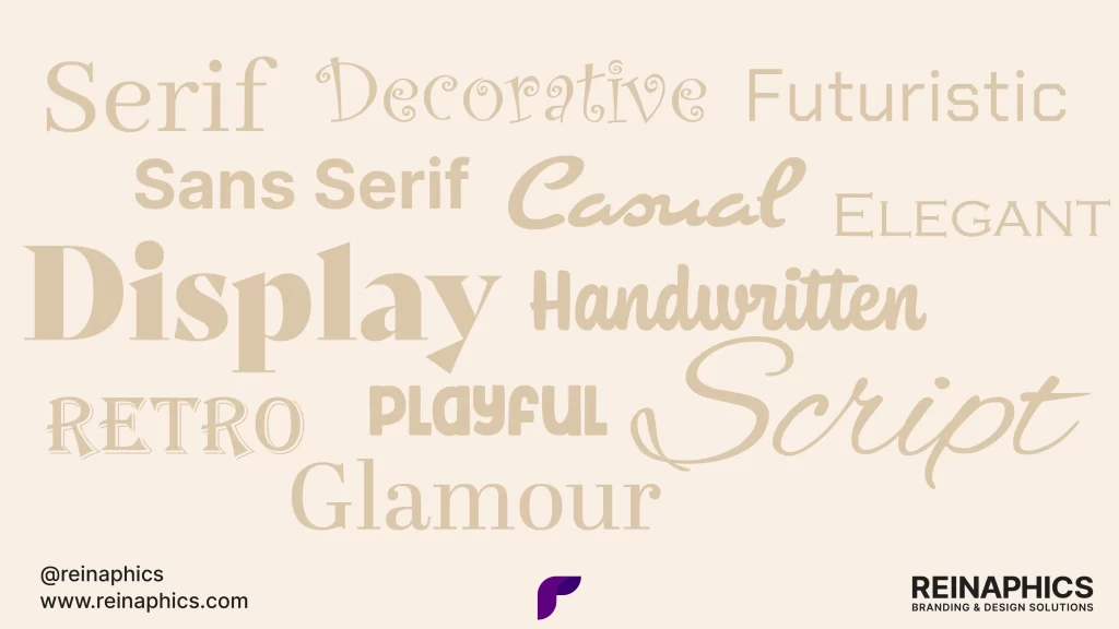
10. Typography
While not always considered a design principle on its own, typography is a crucial aspect of design that incorporates many of the principles we’ve discussed.
Typography can significantly impact the mood and effectiveness of your design. For example, a serif font might convey tradition and reliability, while a sans-serif font could suggest modernity and simplicity.
Also read: Design vs. art: A simple guide to decode the creative crossroads
Conclusion
These principles are guidelines, not rigid rules. If you are a designer, as you gain experience, you’ll learn when and how to bend these principles to create unique and innovative designs. The key is to understand why these principles work and how they can be used to enhance your design’s effectiveness.